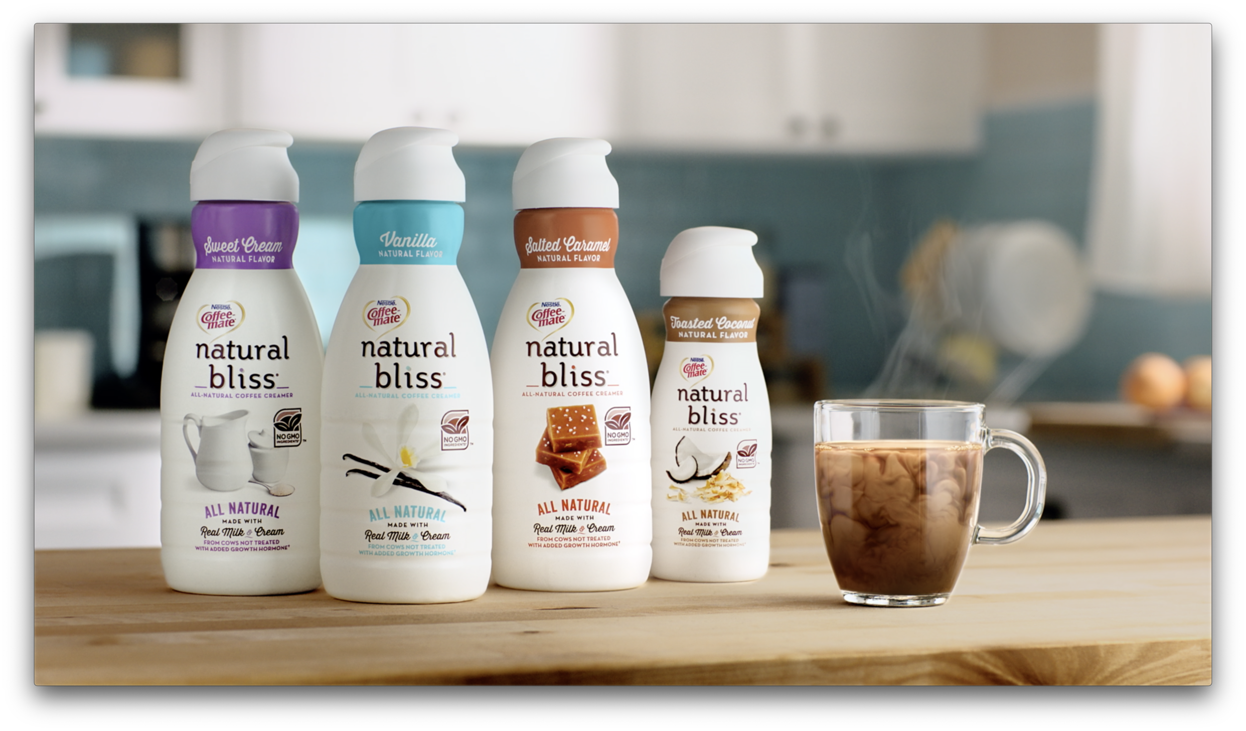
Coffee-mate • Natural Bliss
Creative Direction • Motion Graphics
TVC | Facebook | Instagram
The Problem
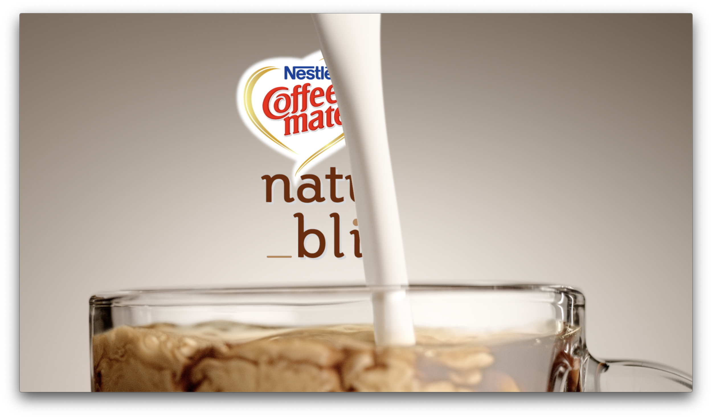
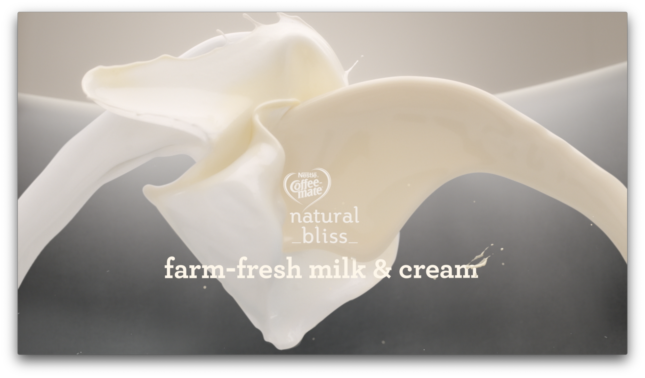
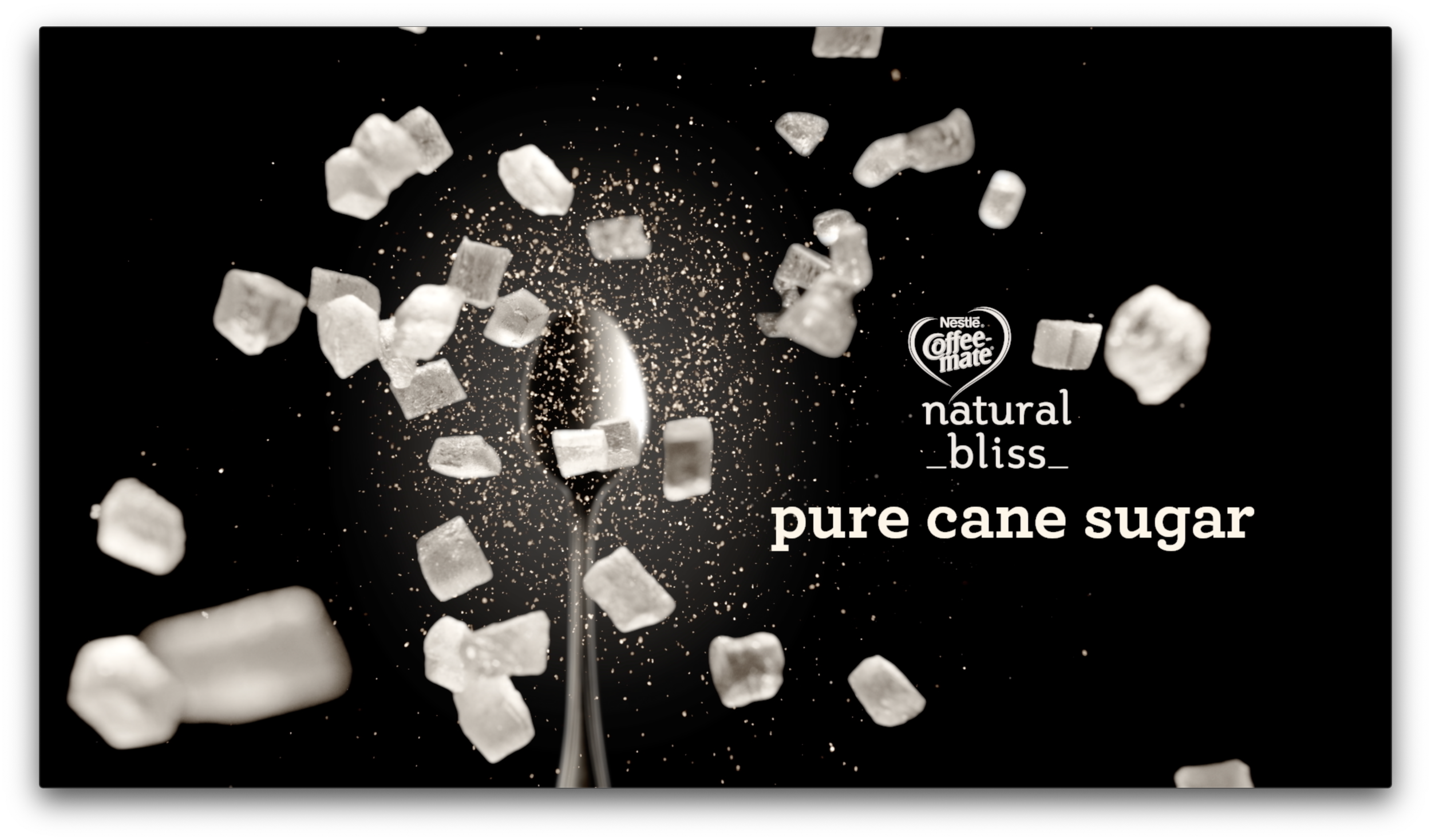
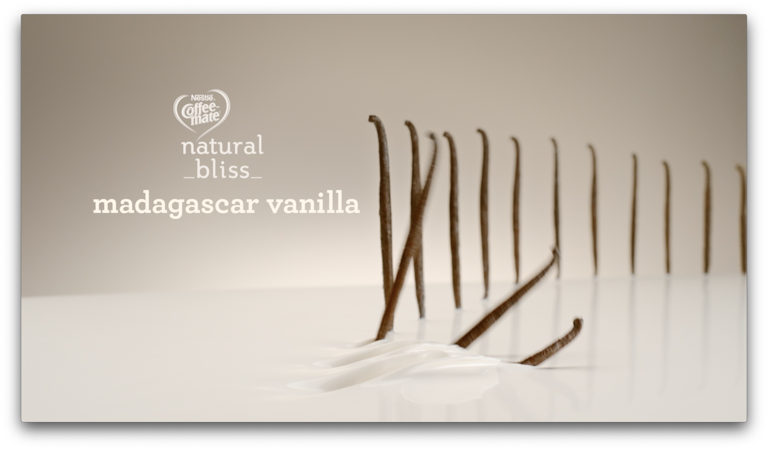
When you have stunning footage, the designer's biggest challenge is simple: don’t mess it up. The question was how to integrate vector text without overshadowing the beautifully shot, minimalist visuals—all while adapting it for three different size ratios.
The Solution
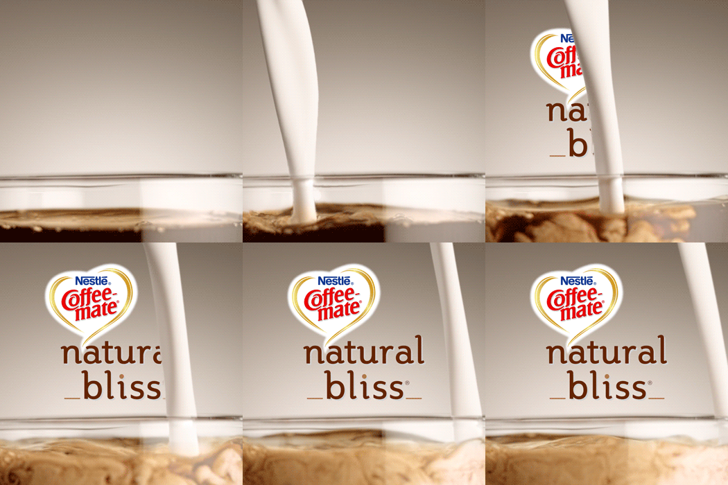
We made sure all the animation was seamlessly integrated into the environment, mimicking the movement of the live-action footage. The goal was to enhance the visuals, not steal the spotlight. After all, the animation should fit into the scene like it was always meant to be there, not crash the party like an overenthusiastic relative!
The Process
Refining Interactions: This project involved multiple rounds of revisions to ensure the text animation interacted perfectly with the ingredients, making it feel natural and cohesive.
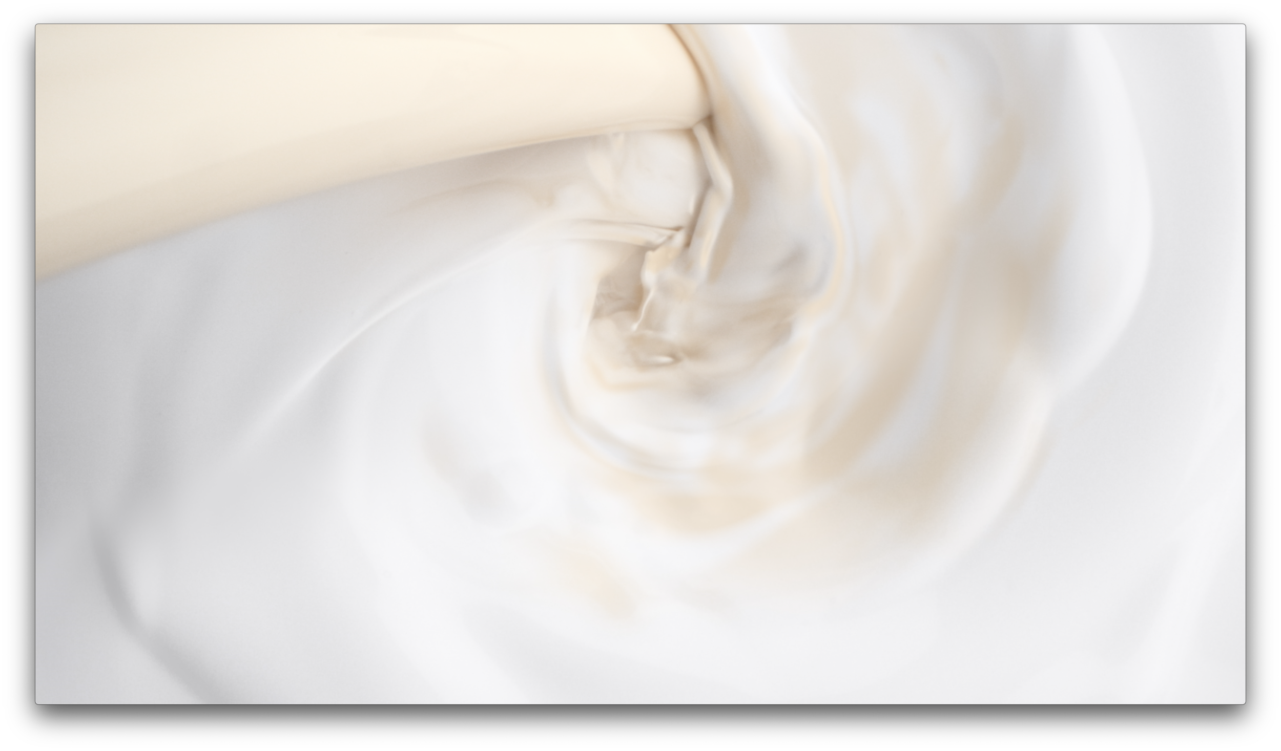
Cleanup and Compositing: Several scenes required cleanup and compositing—one was even made up of eight different takes. If I did my job right, you won’t even notice the stitches!
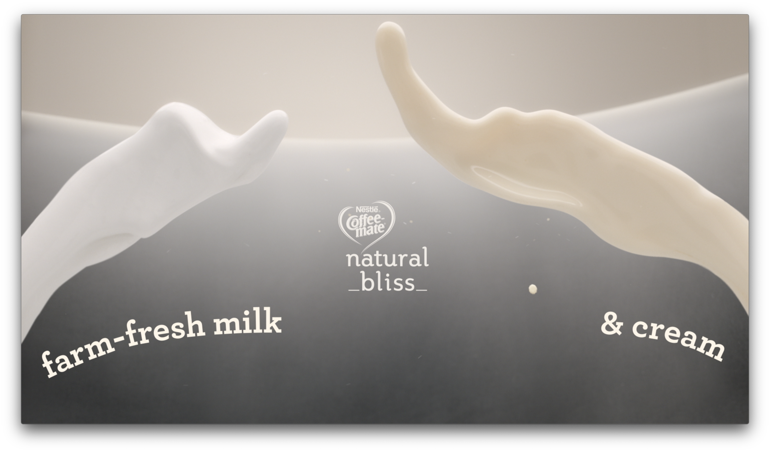
Final Touches: We added animated splashes and sugar chips to fully integrate the text with the live-action footage, creating a dynamic and engaging final product.
The end result was a beautifully harmonious blend of animation and footage that complemented the visuals perfectly. Proof that sometimes less really is more—especially when it comes to making delicious-looking content without overshadowing the main course!

